Tuesday, November 9, 2010

Boosting Your Bottom Line with Effective POS Displays


In competitive retail environments, great “Point of Sale” displays can be the critical element that converts curious shopper into a serious customer. With that in mind, lets go through some tips for great POS displays.


As customers flow through your store browsing the products on display, they are searching for one of two things: More information on the products on display, or a great bargain. “Point of Sale” displays are the ideal tool for both of these goals. By providing prices and a sales pitch to the consumer, they convert window shoppers into paying customers at a higher rate than any other type of retail display or signage.


It all sound simple right? Well the principal is, but when it comes to choosing your POS display of choice, things start to get a little more complicated with the huge range of displays available. Will you opt for table talkers, suspended signage, floor graphics, free standing signs, a modular system, clip frames, pull up banners, shelf decals or a light box?


That’s where the professionals come in. Despite being a considerable capital investment, often the best choice is to hire a retail display consultant. Alternatively you might want to call upon your own experience in devising a display strategy for your shop. In this case there are many online suppliers of POS Displays and products to choose from.


Whatever course of action suits your business, the one thing you can be sure of is that some action is better than none. Point of Sale display is a “trial and error” pursuit, so even if your initial efforts are not successful, you should see this not as a failure, but one step on the road to success!

So good luck… and happy Point of Sales!

Tuesday, October 19, 2010

Free Symbols and Arrows Download

The chances are if you're involved with the design side of retail display (that is the graphic design side) at some time or another you will have come across the need for some stock symbols or pictograms, or maybe a particular style of arrow that has be embeded in your mind.

Well, I don't have the time to design these types of sign and graphic elements myself and I suspect that neither do the majority of designers who are involved in developing retail graphics. That's why when I come across a valuable resource that's made my life easier, I feel compelled to share said resource.

So take a look at these:


These symbols are available as a typeface and what's more they're free! Download 'em here: Free Sign Symbols.

So... do you ever feel the need to tell someone where to go?


Then you can download these free arrow symbols from the Signs & Symbols blog, which has a nice collection of various vector symbol and pictograms to download... along with some mildly amusing commentary.

Enjoy and use wisely!

Monday, July 19, 2010

Retractable Queue Barriers

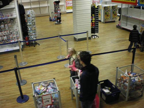
Some of the larger retailers around use retractable barriers as a means of keeping queues at their cash registers in order. It's a problem that all retailers would probably like to have - so many people queueing up to buy that a means of ordering the customer line up is required. But such barriers can also be of use if you have limited space around the register area and that area becoming blocked if shoppers queue in the wrong position. Here barrier posts can be used to ensure your customers wait to be served in the most efficient area.


One bonus of using such queue poles, is that most of these units have the facility to attach a sign holder to the top of the pole. You commonly see the sign holders displaying simple messages such as this:

Would you class that as an effective use of such a sign holder? I wouldn't. Sure it's informative and your customers may need a little bit of direction to have them stand in the correct location, but I would definitely add some branding to sign like this and, even better, incorporate some promotion material into your basic ol' "queue here" message. While customers are standing inline you might as well tell them why your business is so great, or alert them to a special offer that is currently running or try to "up-sell them". Why not?

So treat your queue barrier posts like any of your other display stands and ask yourself.... "How can I make the most of my investment in this product?" What ever your answer is, I guarantee it will be something more that the standard "Queue Here".

Wednesday, June 23, 2010

Suggestion and Donation Boxes

They may not be the first product you think of when you're thinking of adding to your suite of display fixtures, but a suggestion box can be a great way to start a conversation with your customers. People are more likely to give candid and truthful feedback when they can put it down anonymously on a piece of paper, so they are a reliable means of getting customers thoughts on your products, service and staff. Let's face it, if people are encountering a major roadblock in the buy process, you need to know about it!


As an added bonus, when people do leave you a suggestion or comment, you can also use the form that they fill out to collect some customer infomation that you can then use to respond to their ideas or complaints and thus begin a conversation that may become a valueable long term asset. An example of this is that if a customer has made a complaint, you could in turn offer them an exclusive discount, that may make up for their grievances, but more importantly, may get them back into your store when otherwise they might have been lost.
And for when it comes to employing a donation box, this works more as a positive branding excersise, which of course also has the primary function of helping out your charity of choice - it's a win-win!

Tuesday, June 1, 2010

Media Backdrop Banners Are Here

Have you ever found yourself dreaming, that rather than having to spend all that time putting together elaborate shop window displays, you could get your hands on a huge banner stand that you could simply place in your shop window and let the graphics do the talking?

OK, so you probably haven't, but now that I've brought it up, what do you think? If sounds like your cup of tea, you might be keen to know that pull up banners as large as 2.4 x 2 meters are available!

Usually they are refered to as Media Backdrops, as they are commonly used as a backdrop to press conferences as well as sometimes as a backdrop display for television interviews with sports men and women.

Large banner stands like these are are also used at trade shows and exhibitions, where they excel due to the fact that they are so easy to mover around - the large banner retracts into the banner dispays base, the whole unit is packed up in its carry bag for transport.


Anyway there's no need to dream - it's a reality. Media backdrops are here and they're just begging to be used as retail displays... so go for it!

Sunday, May 30, 2010

Ten Steps for Lucrative Point of Sale Displays


For years marketers and major brands have known it, but now these days there is also is a wealth of consumer research proving that Point of Sale display material drives incremental retail sales.

The effectiveness of this advertising combined with falling print and production costs means that this form merchandising is no longer just for the big boys. If you’ve ever considered jumping on this profitable retail band-wagon, but not know where to start, here are some of the key steps in developing a successful Point of Sale advertising campaign…
  1. Your Point of Sale display must carry a ‘call to action’ message
  2. The display message be read and understood at a glance
  3. The most effective results are achieved by linking the display with other in-store advertising or a broader external advertising campaign
  4. Sales representatives or retail staff must be well informed on exactly how to assemble and where to place your POS display
  5. On that note, retail staff must be informed if there is an exclusive offering that goes along with the display
  6. Furthermore, retail staff can be offered an incentive to suggestively sell your deal to customers.
  7. Be sure that the proposed Point of Sale elements is durable enough to last the life of the promotion
  8. It must be considered that all Point of Sale items be cost effectively distributed to their retail destinations
  9. To ensure ongoing value from your Point of Sale advertising campaigns, be sure that results can be effectively monitored and measured
  10. Increasingly, it is desired (and often specified) that Point of Sale displays are able to be easily and efficiently recycled.

By bearing these points in mind while planning and designing you next Point of Sale promotion, you’ll be able to avoid pitfalls and give yourself the best chance for success in this lucrative, yet often overlooked form of advertising. Good luck!

by Jeff Parry

Sunday, April 18, 2010

Window Displays: Dress to Impress in Just 3 Seconds!

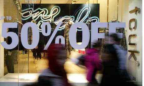
Here’s a frightening statistic - On average a shop window display has just 3 seconds to convert passers-by into customers. Go on, count to three… 1, …2, …3. There! You just lost a customer!

With that in mind, let’s not waste any more time. First off we’ll start with the very basics of what your window display will need to have any chance of impressing on your next wave of potential customers:

Three seconds to impress. Is your message getting through?

Calling All Shoppers
Window displays need not only to capture the attention of passers-by, but also to motivate shoppers to act on their interest. Think about it… these people are out there shopping - they want to buy things! Your job is to convince them that your product is the answer to all their woes and to give them a good reason to buy it right NOW! First and foremost there must be a clear call to action.


A subtle call to action. Are you getting this message?

You’re Selling What?
This seems a little obvious, but you’d be surprised how often it is over-looked. Shoppers need to understand exactly what it is that you’re selling. I can almost hear you saying it: “I’m not an idiot! Of course they get what I’m selling!” And don’t get me wrong, I’d never say you’re an idiot, just be sure to double check that the actual product hasn’t been lost in the creative masterpiece of your window display.


What about this one? Are you getting the message? Or just getting blinded by the light?

Are We Clear?
You need to send a clear message. And to send a clear message, you need to be clear on what your message is. Are we clear? OK, good. But this point isn’t over yet. The clearest message in the world won’t make you a cent in sales if it’s a message that people aren’t interested in hearing. This, of course, comes down to knowing your market. It’s a topic far too vast to cover here and something that I sincerely hope you already have under control - or we might as well just put down our pens and pencils and go home!

OK, we counted down those three seconds and are agreed on how very brief the “window” of opportunity really is. And now we’ve also got the most basic of window display basics under control. But, unfortunately now I’ve got some more bad news for you.

The reality of your situation may be even more brutal than those 3 seconds suggest. You may have the misfortune to be situated near to an extremely well-resourced department store’s window display, a TV store with vast numbers of synchronised screens, or maybe even a troupe of incredibly acrobatic street performers.

This may make life a little difficult

Whatever it is, this surrounding “clutter” must be conquered.

It’s a simple concept, but when you consider that it might actually be well considered and thoughtfully executed clutter that has been put in place by the marketing teams of your opposition (I’m not talking about the acrobats now), then you’re talking about a marketing war. And it’s a war that you can’t afford to lose.

So how do you go about constructing a mighty window display that conquers all clutter and win the hearts and minds of today’s battle wary consumer? In just 3 seconds?

Sheeeesssh…. I don’t know…. that sounds really hard! And in truth the specifics really depend on a lot of variables such as the nature of your business, the size and location of your window display and the products you offer. But don’t despair, what I can tell you are some things that you absolutely, positively mustn’t do! And the majority of the time, that’s half the battle won. So here we go again:
  • Don’t try to say (or display) too much. Tell too many stories in a limited space results in nothing but clutter – and clutter isn’t a story that anyone wants to hear. You’ve heard it before, but less really is more! A strong, clear statement will always triumph over the 'I am trying to sell you everything' approach.
 Less display, more impact!
  • “Apples with Apples” is another basic principle of effective visual merchandising. Don’t be tempted to split your displays and thus dilute your window’s message. Despite some popular theories on today’s fragmented market places, consumers still appreciate the value of an expert. Set yourself up as this expert by ensuring your window displays convey the clear message that you are 'in the business' of the product that’s on display. Being the expert on that product or service gives shoppers a great reason as to come into your shop – even if they are not intending to buy.
  •   "Apples with apples"
  • Don’t forget to have strong visual cues inside your shop. Remember that call to action I talked about? Clearly repeat this with your in-store displays and signage. Think of it as holding the hand of your visitors and walking them from the entrance of you shop through to the products location within. With out this link, even the most perfectly plotted and executed window display falls down.
     
  • Nothing speaks louder to your customers that you’re a static business bereft of ideas than a static window display doing nothing more than collecting dust week after week. Continual renewal is key, so get inspired and in turn you’ll inspire your customers!
     
  • Shine a little light. Lighting is an often over looked component of window displays (as well as in-store displays). And considering that it can make or break even the best displays, it’s a detail that nobody can afford to neglect. Check that the lighting is strong enough and directed on the promotional piece, product or the statement that is key to your message.
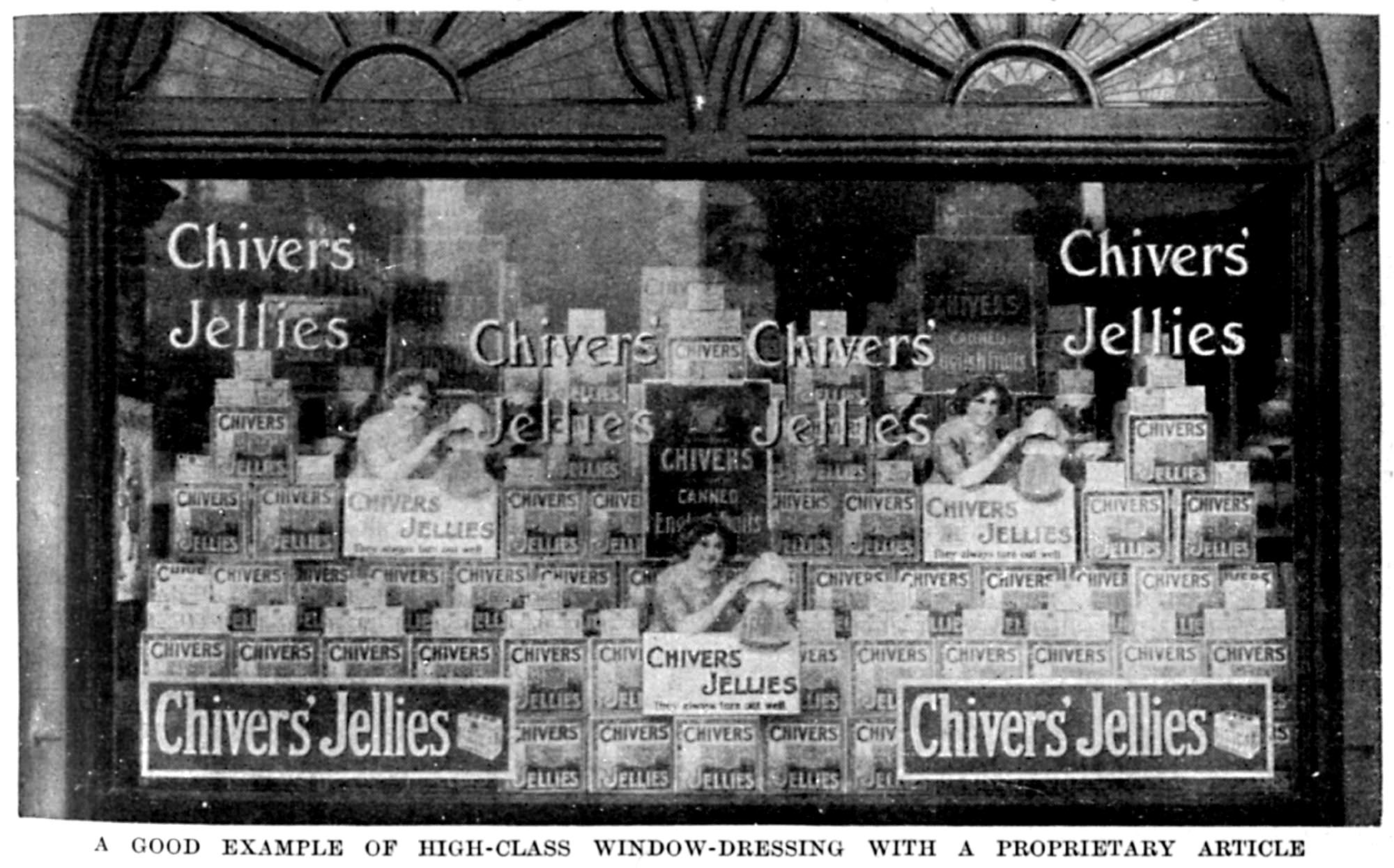
  • Get back to basics. While your busy getting inspired, be sure your not neglecting the basics. The classic shapes of the pyramid, zig zag, fan or step are visual merchandising main-stays because they work! Many an effective window display has been built using these shapes as the base frameworks within the window and there’s no reason that yours shouldn’t be the next.
     
  • The classics are classics for good reason! 
  • Visual merchandising is a specialised skill in itself. In fact it’s a combination of skill, education, artistic creativity, science and invention. You wouldn’t have an inexperienced floor staff member do your accounting for you and you should think of your visual merchandising in the same way. Having a specialist visual merchandiser do your window displays may cost a little more, but can triple its worth in sales.
     
  • Finally, be sure to walk the talk. If your window display is as successful as you hope it to be, it is critical that you deliver on the promise of the window. When a customer is engaged and then let down, due to a stock shortage you undermine not only the current display, but the ability of your business as a whole to deliver on its word.

What do you think? Feeling a little more prepared for battle? I hope so.

Just remember, if you avoid the above mistakes and adhere to basic merchandising principals, you’re already well on your way to ensuring that your window display efforts are victorious. Good luck

Author: Jeff Parry

Sunday, February 14, 2010

Retail Display: Put some Method in the Madness


Do you think that putting together an effective retail displays is a matter of common sense? If so, then you’d be right. But it’s also much more than that. In fact to create a truly great visual merchandising display requires the application of a little scientific method – It’s not rocket science… it is retail science.

An ineffective or unclear display will confuse and frustrate customers. Regardless of how interested, or even intrigued, they may be with the product on display, this confusion and frustration always ends up impacting negatively on sales. You need to put some method in that madness!


In the following paragraphs I’ll outline some basic principals of merchandising that’ll have your customers clear headed, in control and, most importantly, reaching into their pockets to take home what’s on offer. So read on…
Clearly, products displayed at front of your shop will receive the most interest. More specifically, you can think of the critical zone as a 3 – 4 metre semi-circle around the entrance of your shop. This is the red zone! It’s the only display area that will determine in a shoppers mind whether or not they even want to enter your shop. It’s on this valuable piece of real estate that dreams are made… and broken. So it’s here that you need to display your top sellers and any of those wonderful little products, that may not be the cash cows, but tend to evoke fascination and interest amongst your customers.


Well considered shop window displays grab the attention of passers by and act to draw them into your shop. Poorly considered window displays have the opposite effect. Ensure that your window display is kept fresh by redesigning the display every couple of weeks - even more frequently during peak shopping periods – and make use of some bright colour or something that contrasts with the surrounds. If you have the budget, some movement is a great ploy. Whether this be in the form of an old fashioned mechanical- style display, or an LCD screen loaded with fresh content should be dictated by the appropriateness of the technology to your product or service range.

A general rule of thumb is that products displayed on tables and walls will move! Of course the product must be appropriate for your clientele, but display hangers on walls are an effective way to highlight new products as they fall directly in the customers’ line of view. If you are planning interior renovations, think about building more wall space. If this isn’t in the budget, the next best move is to use display shelving to increase prime display space and group products into product or style categories.
People need to be able to move freely through your shop. It’s important that they have space to stand a little back from your shelves, take in the entire display and then move in closer to handle the products on show without having to be constantly thinking whether somebody else is trying to squeeze past.
About 1500mm to 2000mm is a good spacing while the display racking itself should be no higher than 1500mm. An investment in good quality shelving or racking can save you a lot of frustration in the long run. A quality product will be designed to facilitate day to day maintenance and add some flexibility to your display.

The pricing and ticketing of your products must be as uniform as possible. How often have you been in a shop, found an item that is of interest only to be unable to find a price? If there is not a staff member in the immediate vicinity you are likely to just walk away. This is an area where it is imperative to make it as easy as possible for your customers. Remember: If it’s easy to shop, then it’s easy to buy!


At the end of the day, great displays equate to great sales. So don’t just throw product on the shelves and hope for the best – that’s madness. We are all creatures of habit, so play on that desire for order and understanding with a little sharply focused Retail Science. Then all there is to do is to sit back and listen to the register ring!

Wednesday, January 13, 2010

A Great Little Retail Article

I've been trawling for Display Stand and Visual Merchandising articles this morning. There is a lot of pretty poor and uninformative articles around when it comes to the topic of Retail Display, but I've managed to find one that has some great little tips and should help any retailer increase sales by simply making the most of the display space they already have available. How does that sound?

The six tips are as follow:

1. The only way is up!
2. More is more!
3. Shine a little light!
4. Razzle dazzle ‘em!
5. Focus, Spotlight, Highlight!
6. Repeat, Re-shuffle and Renew!

Obviously that won't make a lot of sense to you, but they should get you thinking enough to go and have read of the rest of this great retail article. Otherwise, good luck and... Happy Retailing.

Monday, January 11, 2010

Lecterns (and Lecturns) for Retail Use?

I'm going to stray somewhat off topic here and have a look at a couple of Lecterns. You couldn't exactly say that they are a retail display product, but you do see them used by travelling salesmen and the like in shopping centres and malls - they're also popular at trade shows and exhibitions, which is a bit of a cross over area for retail display.

I came across a retail display blog that features a couple of models of lecterns (or lecturns) and just thought they looked like a good product and that they could be well utilised in a retail environment. I could easily imagine one with some promo brochures displayed and manned by a staff member demonstrating a new or featured product.


Monday, January 4, 2010

Display Stand Design for Dynamic Exhibitiors

If you’re about to reach into your pocket for a company stand at the next expo or exhibition in an attempt to snare some new business, it pays to ensure that your display stand design stands out from the crowd. The amount you choose to spend on your stand is limitless and if exhibition designers had their way, we’d all go broke! Regardless of how expensive or “designed” your stand is, you can’t afford to lose sight of the basic idea of exhibiting – return on investment.

A great example of using product and colour to create an effective display stand that commands attention

Display stand design trends
Clearly you need a stand that not only reflects your business and illustrates your product, but it must catch the attention of passers by. It’s possible to create eye-catching and visually exciting display stands using only a simple portable display combined with some top quality graphics that will have your business standing out from the rest.

As with products on the market there are clear and identifiable trends in portable display stands as designers and manufacturers jostle to come up with the next big thing. Pull up banner stands were once the buzz word - and now everyone’s using them. That’s not to say that they don’t have their place, but serious exhibitors must keep abreast of all the new systems that are coming on to the market if they want to keep pace with their competition and have a display stand that really shines.


 New systems allow for more dynamic shapes and constructions

Types of display stand systems
There is a range of options to consider when it comes to choosing your display system, all with their own unique characteristics. You may choose to attract attention with sheer force by opting for a stand that allows for a huge graphic area. Or it may be the shape or construction of the stand that separates you from your competitors. Stands are currently available with striking curved display shells, intriguing geometric stand designs or ingenious locking panels.


An expandable display stand system allows you to customise a stand to your needs and add to the stand in future years

An expandable system is always a good option in that it will allow you to add panels and create different shapes or when you need to upgrade to a larger display stand for future trade exhibitions, you can simply add to your existing display rather than starting from scratch.

Graphic design
Many suppliers have in-house designers who can provide graphics for your stand to your exact requirements, whether it's a company logo, message or other visuals. But be warned about using “free” or even low cost graphic design options, as the cold truth of the matter is that you most often get what you pay for. Effective display stands work because they thrust your graphics forward into the view of your target audience. So why pay all that money for the latest display stand or system just to present a sub-standard image of your company? It’s your stands graphics that will allow it to really shine and to reach its full marketing potential.


Large text is easy to read from afar and ensures your message gets heard

If you are creating your own graphics, remember that colour is a great way to create impact, so use it wisely. The clarity of your display message is critical, so don’t fall into the common pitfall of trying to give too much information and losing the clarity of your display stands message. The message of your display needs to be effective both up close and in attracting viewers from across a crowded exhibition hall, so at least some images and text should be large, while some smaller scale detail can be included to be read by the viewer after they approach your stand.

Lighting and accessories
A brightly lit display stand attracts attention, while spot lighting allows you to really highlight a particular message or product, or maybe just your company logo. Be sure to ask your supplier about display stand lighting options and be clear about the supply of power supply and where it will be available to you on the day of the display.


There are a range of other display accessories designed to help make your display stand design a success and ensure that your message gets heard, so consider display products such as brochure holders, poster displays, banners and counters. And bear in mind that, as mentioned earlier, some display systems are modular and come with their own array of compatible and co-ordinating add-ons that will give your stand a strong and cohesive look with the flexibility to suit the display space.

An effective display stand that stands out form the crowd must be more than just a talking point, but should be viewed as a priceless marketing tool with the potential to increase sales and generate leads that could potentially provide a income stream for years to come. So be sure to plan well ahead and enlist the help of an experienced display stand supplier to advise you what’s best for your business and happy exhibiting!


See more images of this great display stand here